For any site with content, readability is the big wheel of design. Without it, your visitors won’t understand your text, and at worst, you’ll alienate those with visual impairments – sending would-be traffic to other sites. As such, you’ll want to ensure you get some of the best fonts for blogs. The top choices are ones that will work for all of your readers. However, there’s a lot to choose from, which means you’ll need some help to narrow down your options.
In this post, we’ve done all the work for you, and we’re going to share with you some of the best blog fonts available. We’ll also bring along some choice pairings, too. 😎
First, let’s run over why picking the proper typography holds so much sway in designing your blog.
The role of fonts in a blog’s design
In short, your choice of fonts offers clarity to your content. In a direct sense, it will affect the readability of your blog. Not only will the right font make your text clearer to read for all users, it can also keep them more engaged with your content.
With the right typographical decisions, you’ll be able to achieve this by minimizing the possible negative factors, such as eyestrain and confusing legibility for those with neurological issues, such as dyslexia. Of course, the better the readability, the greater the user experience (UX).
However, you should also consider how a font will present your brand. Being a blogger, you can’t neglect this, as it’s vital for providing a focused presentation of your content. As an extreme example, you wouldn’t want to use a bold and striking font, such as Futura, for a “mom blog:”

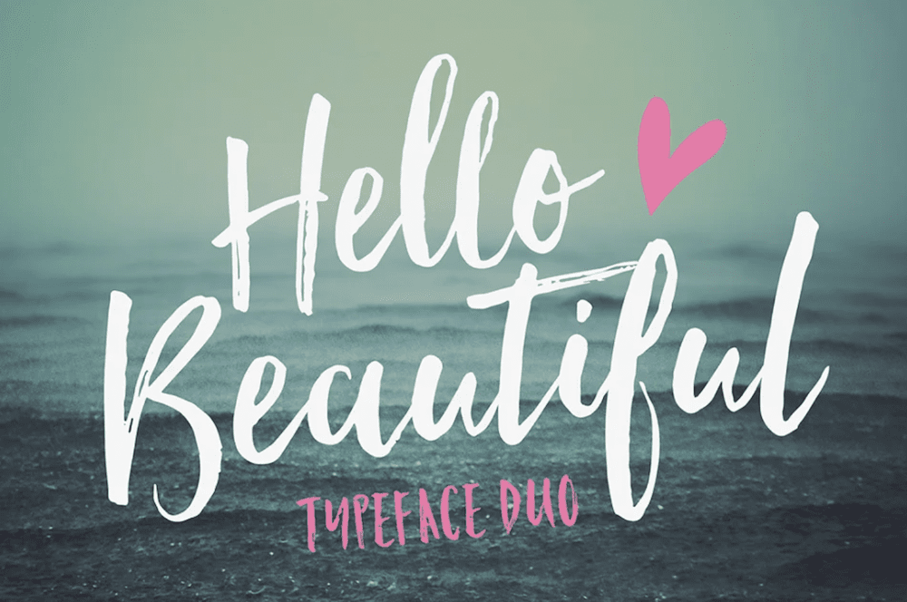
Another poor blog font choice would be to use the whimsy type of font, such as Hello Beautiful, for a law firm’s content marketing. It’s a playful, aesthetic font, but being playful isn’t the tone you’d want to give off as an attorney dealing with serious legal matters:
You need to consider the impact on the reader when choosing from the best fonts for blogs. However, this isn’t the only consideration to make.
The factors to consider when choosing from the best fonts for blogs
We’re not going to break down every single factor there is for choosing a font, but there are a few technical considerations that should be a part of your selection strategy:
- Serif vs. sans-serif fonts. This can impact legibility in a big way, as the “lips” and flourishes of serif fonts can distract the eye in the wrong setting. However, neither option is wrong – just a sub-optimal situation.
- Sizing and line spacing. Your font’s base size is important, as this will affect legibility and scalability for small-screen devices. The spacing between the lines will also have an impact on density. If your content looks dense, it will be less inviting and potentially confusing to read.
- Font styles and weights. In short, bold and heavy fonts will suit large headings or hero text. Slimmer fonts will be better for body content.
With these points in mind, you’ll be armed with all you need to choose from among the best fonts for blogs.
5 of the best fonts for blogs (and solid pairings for each)
Across the rest of the article, we’ll look at five of the best fonts for blogs, and introduce a good pair for each. Here’s a quick list of what we’ll feature:
The first font choice on our list could be just the one you need, and works really well in a number of use cases.
1. System fonts: the best fonts for blogs
You likely already know about web-safe fonts, such as Arial, and Verdana, and Georgia. These are some of the most popular fonts for websites, but they can date your blog fast. An even better solution is to use system fonts related to the user’s operating system (OS).
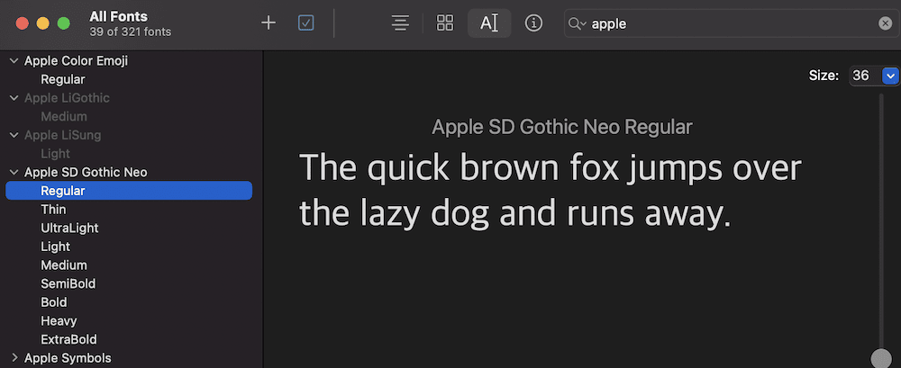
This will probably be the main font the reader will see all over the place when using their computer. As such, it will be familiar and (hopefully) readable. Of course, the font your site uses will differ based on the device and OS, but this adaptability seems to work in almost every use case.
Some popular page builder plugins (such as Elementor) and themes (GeneratePress) offer this as an option:
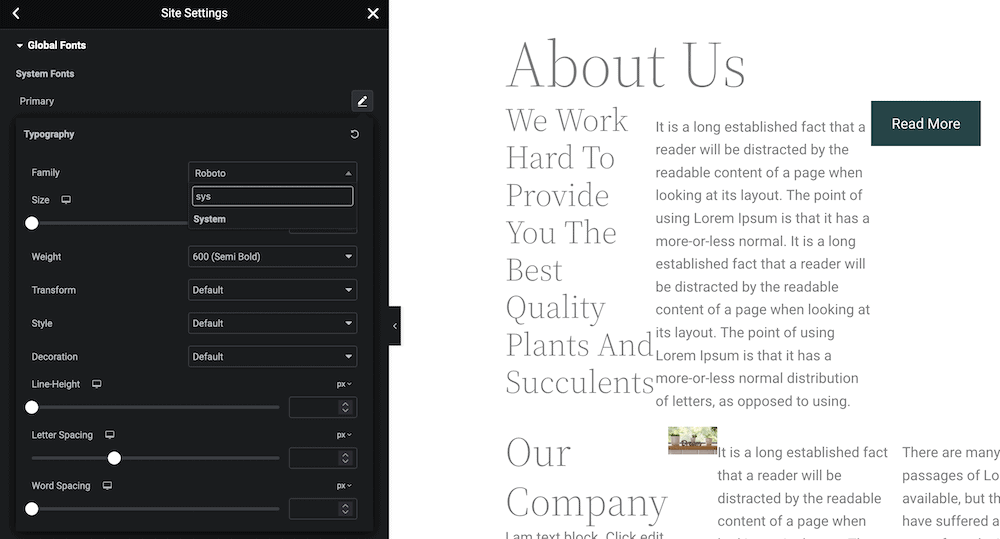
Even better, if you’re using WordPress and your theme doesn’t offer the option to use system fonts, you can add it in with some quick CSS or you can try this plugin.
2. Montserrat / Merriweather
The Montserrat and Merriweather font pairing is a brilliant choice if you want a balance between modernity and classic elegance. This is also the font pairing for the Twenty Sixteen WordPress default theme.
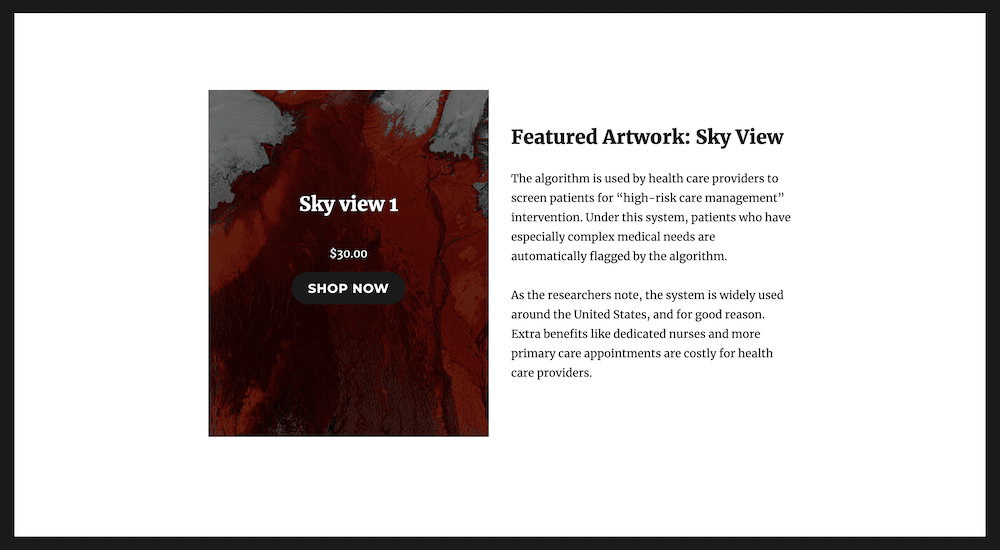
Montserrat’s clean and simple sans-serif design complements Merriweather’s more traditional serif look, creating a harmonious visual contrast. We like to see Merriweather in use for headings and Montserrat for body text. However, its legibility and readability make these fonts popular for text-heavy applications.
3. Roboto / Lora
You’ll know Roboto as Google’s clean and crisp sens-serif Android default font. The company gives Roboto a modern feel, and it’s versatile enough to use for both headings and body text.

In contrast, Lora is a serif font that adds an elegant and a classic touch to any design.

You’ll find this as an option in the Raft WordPress theme. To implement it, open the Themes > Editor screen within WordPress, then navigate to the Styles > Typography menu. Each of the available elements (Text, Links, Headings, and Buttons) will offer the options to use Lora and other fonts:
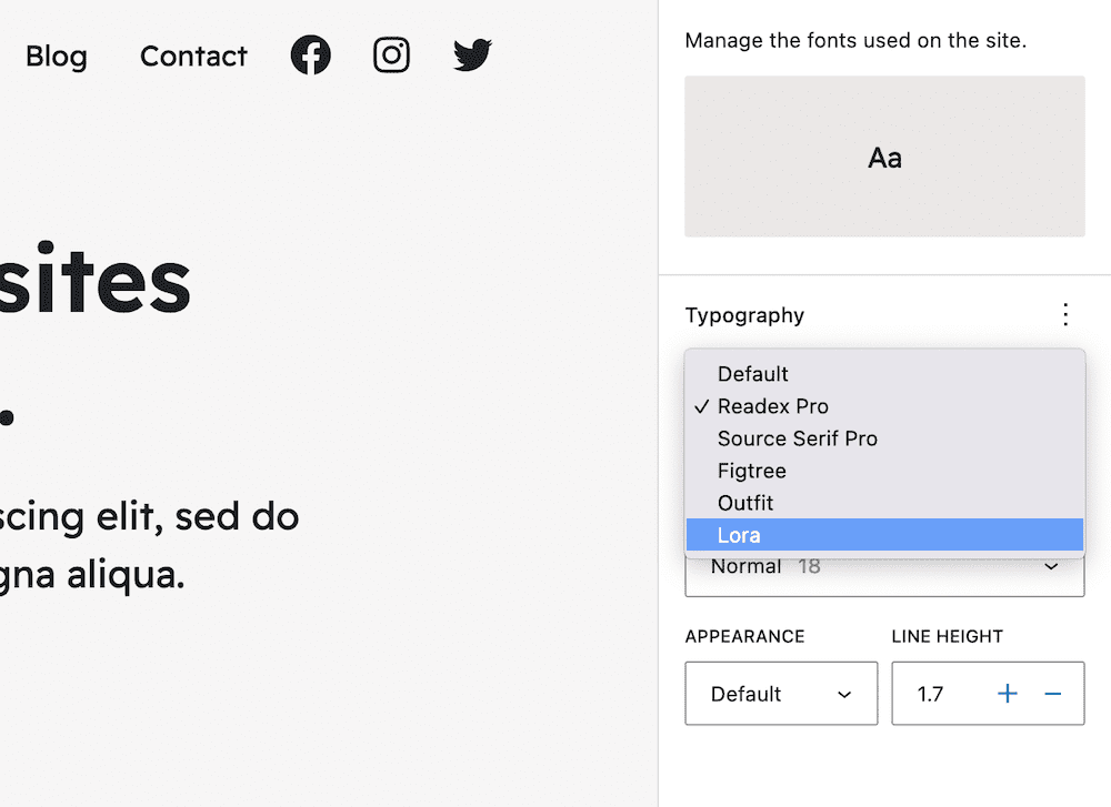
Together, these fonts create a beautiful contrast that’s perfect for creating eye-catching headings and easy-to-read body text in any blog design.
4. Open Sans / Cardo
Next up, we have a humanist sans-serif font that’s versatile and easy to read, again from Google. Open Sans is a versatile sans-serif font with a clean and contemporary look.

If you pair it with the serif Cardo, you can give a classic and elegant touch to any blog design:

This combination creates a visually pleasing contrast that works well for both headings and body text. It’s a great choice that offers a clean and legible design, and balances modern and traditional styles.
5. PT Serif / PT Sans
Public Type (PT) Serif and Sans are a font pairing that provides a modern, yet classic look. They’re free, and also support all the various Cyrillic scripts in use. PT Serif has a traditional design and is great for longer articles and blogs thanks to its readability.

In contrast, PT Sans offers a clean and modern look:

This font pairing offers a harmonious balance between style and readability. As such, it’s going to suit almost any blog well. You’ll be able to use either fonts for both body text and headings, too.
Conclusion 🧐
Typography can kill your blog just as much as it can bring it to another level. The best fonts for blogs all stay in the background. By this, we mean that visitors won’t overtly care about the font you choose, but will stick around on your blog for longer if you choose a good pairing that’s appropriate for your type of site. If you get numerous complaints or “recommendations” to replace your current font choices, you’ll want to consider swapping them out.
There are lots of font choices available for blogging, and in this post we focused on body copy. As such, using a system font is a solid, proactive approach that will prevent many potential issues from manifesting. Your blog will display in a familiar font for the end user, which means it’ll be legible to them because they see it everyday when they use their device. What’s more, you won’t have a performance hit on your server, because there will be no external font library to load.
However, you can’t go wrong with the four classic pairings we featured either, even if they aren’t as optimal from a performance standpoint. In most cases, the impact will be marginal anyway. And unlike with system fonts, you’ll have the added benefit of providing a consistent viewing experience to everyone, regardless of what the default fonts are on their device.
With good typography on your blog, you can showcase some of your stellar writing. If you choose to apply for one of the freelance, remote, or full time jobs on our board, the right font will “step aside” to let your content and talent shine through.


